
Author website basics
There are a few very easy – and very important – things all authors should do on their websites. How you do them is up to you – but if you’re not doing these things, you should put them on your to do list right now.
That said, there’s only so much time to fit everything into, so my suggestion is that you make a list of non-writing tasks, prioritize them all, and chip away at them as you have time. This is how I handle these types of things, and while it can feel daunting to look at your list, it also means that when you do have a few minutes you know exactly what the next most important thing is.
Published works
Make it easy to see the books and stories you have published, where to buy each one, and what your latest publications are.
If someone looks at your website and has to dig around to find what you’ve published, they might give up and leave. Ditto for buy links. The entire experience should be as simple and easy as possible.
It’s also important to make it clear what your latest publications are. If the reader thinks the last thing you published was five years ago, they might conclude you’re not actively publishing – even if you’ve published another seventeen books since then. Sure, your dedicated readers will stay on your website, but even with them you want to make this as clear as possible.
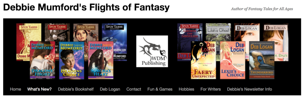
Debbie Mumford does a great job at making it quick and easy to see what she’s published, how to learn more about and buy each story, and it’s clear what her most recent titles are. The “What’s New?” link in her site’s header that goes to a page where she announces new releases. For each title she includes the cover, information about the story, and buy links. In addition to this, the right sidebar of her site has a section called “Check Out Debbie Mumford’s Newest Titles” that contains cover images for her most recent publications. Clicking on one of these cover images takes you to that title’s page on Amazon.
Website -> social media
Links to your social media accounts should be visible on your main page, your blog (if that differs from your main page), and ideally on every other page on your website unless there’s a compelling reason not to put them there. For example, they might not be appropriate on a landing page – but they definitely fit on a page listing all of your published novels.
This is very easy to do, but a surprising number of authors don’t add these links, or else don’t put them on the main and/or blog pages. The easier it is to find you on social media, the more likely it is that people will start following you there.
![]() All of the main pages on my website have a right sidebar which displays buttons linking to my social media accounts at the very top.
All of the main pages on my website have a right sidebar which displays buttons linking to my social media accounts at the very top.
Social media -> website
In addition to having links to your social media accounts on your website, make sure to set up links back the other way. And, of course, your social media accounts should link to each other as well.
Consider adding author information to your personal Facebook profile as well.
About the author
 Make sure there’s at least a brief biography/about the author section on your website. Not only will your readers enjoy learning a little more about you, this also should be something that a potential editor, blogger, etc. could pull from for an introduction to you on their site.
If you regularly write in one or more genres, consider adding that information as well.
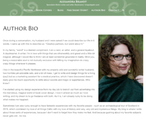
Alex Brandt’s author bio page is a great example. It includes a photo of Alex – while you don’t have to include a picture of yourself, doing so can help your readers feel a little more connected to you. Alex’s biography gives an overview of what she enjoys writing and why, and her charming personality comes through to the reader.
Contact information
What if someone wants to turn your book into a movie, or wants to ask you to participate in an invitation-only anthology, but but they can’t figure out how to contact you? 🙂
Be careful with what contact information you make publicly available. A lot of authors have contact forms on their sites to keep from getting spammed by programs that search for email addresses. Another option is to list a contact email address, but have it display as an image instead of text. Just make sure you have some way that people can reach you.
Newsetter
 If you have a newsletter, make the fact that it exists clear, and make sure it’s super easy to sign up for.
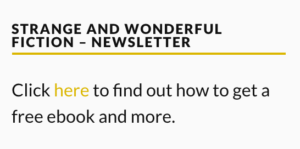
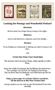
DeAnna Knippling has a link to her newsletter signup form in the right sidebar on the main pages on her site. Not only does this allow the reader a quick and easy path to sign up, DeAnna also shows a bit of her very interesting personality 🙂 in this section with the text “STRANGE AND WONDERFUL FICTION – NEWSLETTER.”
Personality/branding
 Your personality is going to come out in your website whether you intend it to or not. Put some thought into who you are and what you want to convey, and over time you can modify your site to reflect that.
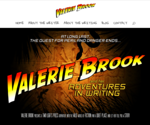
Valerie Brook’s website is one of my favorite examples of how to incorporate your personality into your branding. She’s got the basic elements present, but by using a movie-like look she grabs your attention on the home page. The header image and font are used throughout her site, continuing her fun theme.
 DeAnna’s personality comes out on her newsletter sign-up page. Not only does she make it easy to get to this page, once you’re there it’s hard not to be intrigued and want to sign up for her newsletter – and read her fiction! Notice that she repeats the text “Strange and Wonderful Fiction” which is listed on the sidebar on the pages that link to the newsletter sign-up page.
 Adding some of your personality to your site doesn’t have to involve anything complex. For example, one of the things I do on my site is have this super awesome retro shape displayed at the bottom of the sidebar, and every once in a while I use it in other places as well. This is super simple to do, and the image conveys a little bit about my personality.
Now what?
If you’re not sure where to start, don’t panic! 🙂
Make a list of the things you’d like to do to your site, even if you don’t have the time to do them right now. Prioritize these things, even if it’s just noting that one of them is a higher priority than the others. This way you have a plan for what to do and where to begin.
If you want to do something but aren’t sure how you want it to look, consider starting with something basic. For example, it’s totally fine if you have plain hyperlinks to your social media accounts instead of fancy buttons – the key is to get the links set up. You can change how they look later.
When you look at other authors’ sites, pay attention to what you like/don’t like as a reader. This can help you become more aware of what you can do to improve your own website.
I add/improve things on my site bits at a time because I almost never have huge blocks of time – and if I did, I’d want to use most of that time for writing. I keep a list of tasks so I don’t forget what else I want to do with my website, and I add things to it as I learn new things, or realize I missed something a while back. I’ve been working on my site for years, and I don’t see that ever coming to an end. 🙂 But having a plan helps me know what to work on next.